Hobbies & crafts Listicle
Portrait photography colour palettes by zodiac: clothing and background matches
A photographer-friendly list of flattering palettes for each sign that helps you pick clothing, background and prop colours to flatter skin tones and convey personality. Includes notes on lighting, contrast and simple swap options for
Pisces — Sea‑mist and pearl
Soft seafoam, pearly lavender and desaturated aqua capture Pisces’ dreamy vibe, but these near-neutral hues can wash out in flat light. Favor textured fabrics (knits, silk) and add a mid-tone background like warm grey or faded teal to keep contrast. Swap in a slightly stronger accent—deep indigo or muted plum—if skin tone needs lift.
Cancer — Moonlight and oyster
Lunar whites, silvery greys and pale blue read as caring and nurturing. These tones work best with soft directional light (rembrandt or window light) to create gentle shadows; a cool mid-grey backdrop prevents the subject from disappearing into the set. If you want more warmth, introduce a cream or soft rose accent in a scarf or prop.
Virgo — Soft neutrals and sage
Clean beiges, dove grey and muted sage emphasize Virgo’s understated precision. These palettes photograph crisply with higher contrast—use slightly stronger rim or key light to define edges. For more visual interest, add a single crisp dark element (charcoal belt, navy jacket) as a simple swap to anchor the frame.
Taurus — Earthy greens and warm brown
Olive, moss and warm chestnut are tactile and flattering across many skin tones. Use natural-looking light and a textured backdrop (weathered plaster, mottled green) to amplify the organic feel. If greens compete with foliage, shift to terracotta or camel accents for clearer separation from outdoor backgrounds.
Capricorn — Charcoal, navy and camel
Classic, structured palettes of deep navy, charcoal and camel read as authoritative and timeless. They hold up in both studio and location shoots; use hard or directional light to preserve texture in wool and leather. For a softer mood, swap the camel for warm beige and reduce contrast slightly.
Gemini — Dual contrast: teal and mustard
Gemini wants a visual conversation—pair a bright teal with warm mustard or ochre for playful contrast. These complementary-ish colours pop in mid-key lighting and photograph well on plain or subtly patterned backgrounds. If the duo feels too loud, mute one colour by choosing a desaturated version for clothing and keeping the other bright as an accent.
Libra — Blush, navy and balanced pastels
Soft blush paired with mid-tone navy or slate keeps Libra harmonious and camera-friendly. Pastels need careful contrast management—choose a deeper background (muted navy or charcoal) to keep skin tones from appearing flat. Swap blush for cool mint for a fresher variation that preserves balance.
Aquarius — Cyan, silver and electric accents
Aquarius leans modern: cyan, cerulean and cool metallics read as inventive and slightly aloof. Use controlled, directional lighting and dark or neutral backgrounds to make cyan sing. If cyan is too crisp for skin tones, introduce a softer blue-teal or a neutral mid-grey as a buffer.
Sagittarius — Denim indigo and warm spice
Indigo, terracotta and sunset orange feel adventurous and photograph reliably across skin tones. These tones handle outdoor light well; pair indigo clothing with a warm textured backdrop (brick, rust) for pleasing separation. To dial down saturation, replace orange with a muted rust or cinnamon.
Scorpio — Deep maroon and onyx
Intense palettes—maroon, oxblood and near-black—create dramatic, moody portraits. High-contrast lighting (shorter fill, stronger key) sculpts facial features and preserves the drama; choose matte fabrics to avoid shiny hotspots. If full drama is too severe, swap black for deep charcoal and add a soft skin-warming light source.
Aries — Bold vermilion and warm neutrals
Aries thrives in confident reds—vermilion, tomato and warm terracotta backed by beige or warm grey create lively, energetic portraits. Use slightly higher contrast and punchy key lighting to match the palette’s intensity. If red overwhelms, convert it to a rust or burnt orange for similar energy with less saturation.
Leo — Golden ochre and regal amber
Leo’s show-stopping palette—golden ochre, amber and warm honey—delivers high-impact, flattering portraits for almost any skin tone. Warm, directional light enhances the gold tones and creates a luxurious glow; a deep complementary background (teal, deep plum or chocolate) provides heroic separation. For a subtler option, move to muted mustard and warm beige while keeping the same lighting approach.
If this was useful
Try one of these next
Home & life Listicle
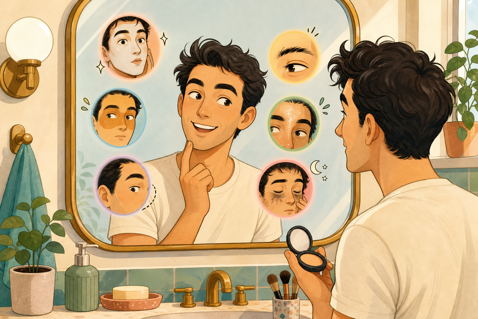
6 makeup mistakes men make and exactly how to fix them, ranked by how obvious they are
A useful, mildly mischievous ranking of common slip-ups—too much product, mismatched shade, unblended edges, ignoring brows, shiny T-zone, skipping removal—with concrete fixes for each and a short test to confirm the problem is solved.
Read article
Bike & travel How-to
How to pack a minimalist men's makeup and grooming kit for a weekend trip
A compact packing how-to with an exact checklist, space-saving tips, and a suggested order of use so a 5–7 item kit covers shine control, blemishes, brows and camera prep. Includes TSA-friendly sizing notes and lightweight storage ideas.
Read article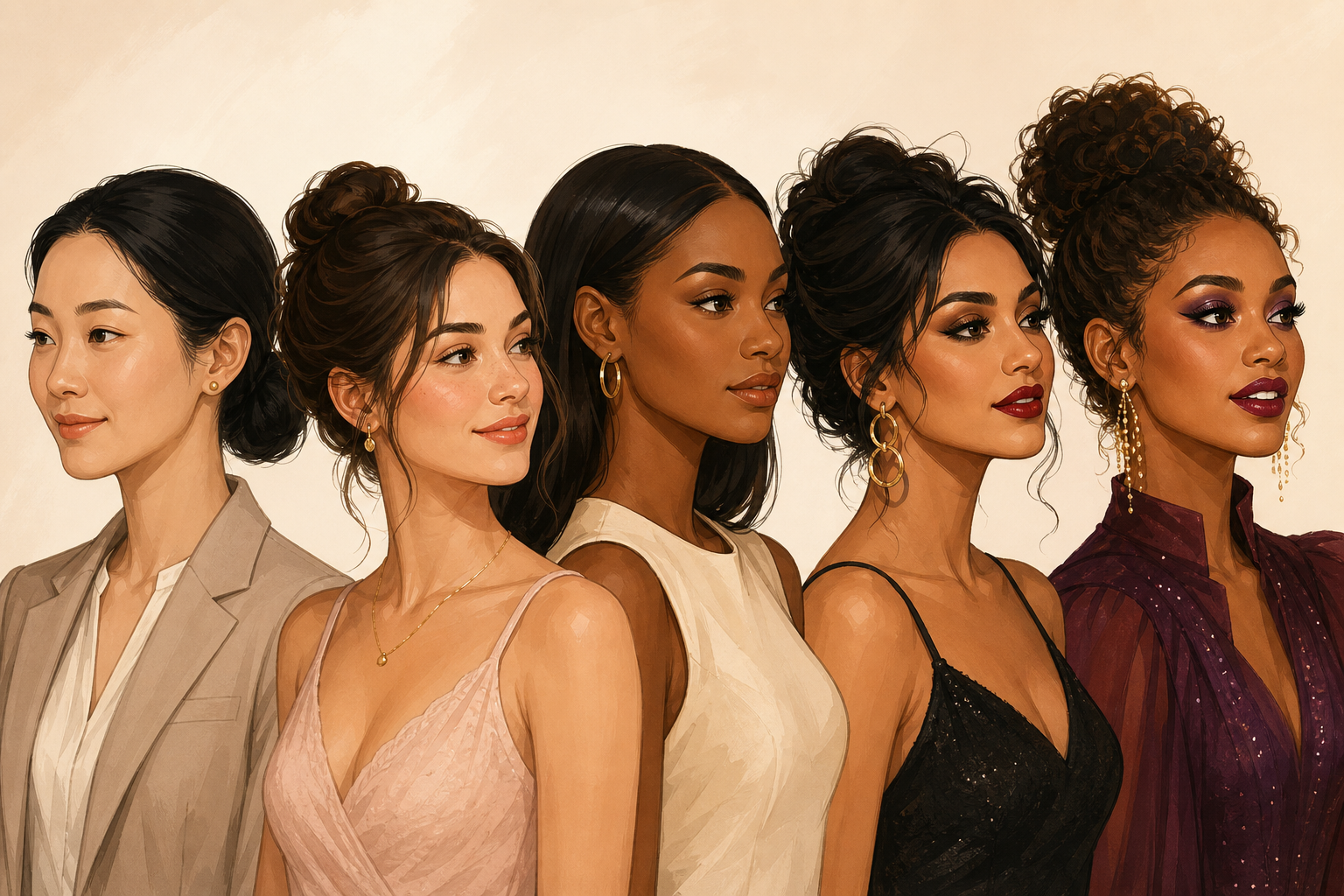
Home & life Listicle
5 subtle makeup looks matched to real occasions
Five pragmatic, low-drama makeup moods—ranked from the quietest to the most camera-ready—matched to actual situations. Each entry explains which features to nudge and which to leave alone so your face reads right for work, a first date, a photoshoot, a night out, or a stage/presentation.
Read article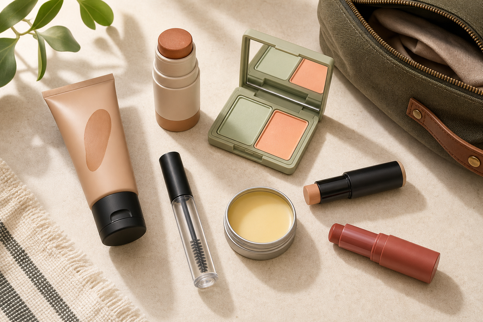
Home & life Listicle
7 multitasking makeup and grooming products for men, ranked for simplicity
A ranked list of seven versatile, low-effort items (tinted moisturizer, clear brow gel, color-correcting concealer, etc.) chosen for how many problems each solves and how easy they are to use. Practical pros/cons and a one-line best-use tip
Read article