Home & life Listicle
The best living-room paint palettes, ranked by zodiac sign
A ranked list of durable, versatile paint palettes matched to each zodiac sign’s temperament — from grounding neutrals to dramatic jewel tones. Rankings are based on long-term wearability, light performance and ease of accessorising so you can pick a palette that still looks smart after years of couches, art swaps and winter light tricks.
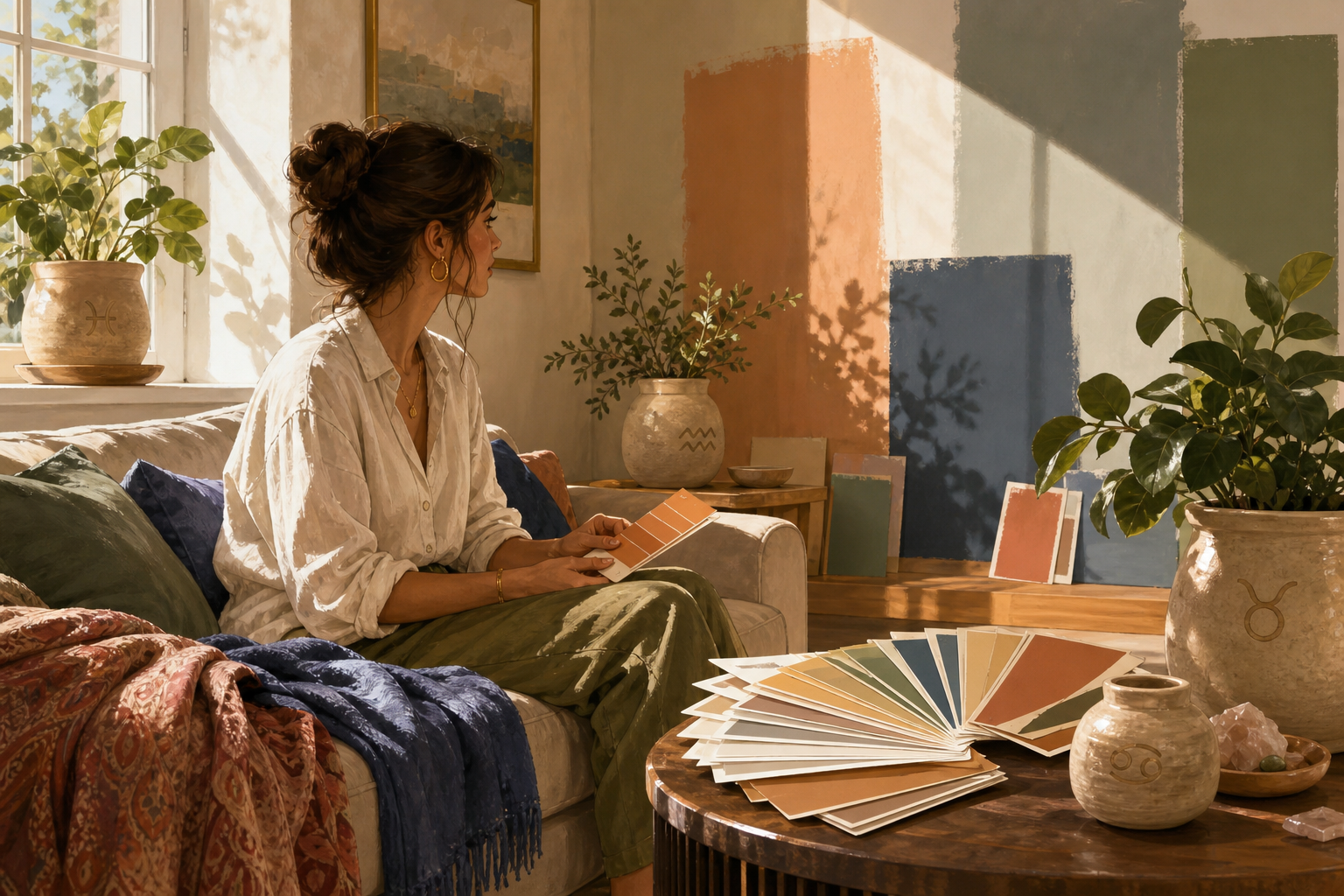
Aries — Fiery accent trio
A high-energy red, a warm terracotta and an off‑white make a dramatic trio that thrills in sunlight but can overpower a living room’s sense of calm; excellent for a statement wall or accent furniture, less compelling as a full-room palette because bold reds absorb light and limit neutral accessories.
Gemini — Split-personality pairing
Two high-contrast colors—think sunny ochre with cool slate—suit a social, changeable vibe and keep things lively; the pairing reads fresh in bright rooms but will flip between warm and cool depending on light, so it’s trickier to style long-term without carefully curated accents.
Sagittarius — Adventurous saturated mix
Saturated blue with warm ochre and crisp white brings an adventurous, collected feel; great if you love travel-inspired color, but the strong hues are trend-sensitive and need balanced lighting and simple furnishings to avoid dominating the space.
Aquarius — Icy teal and metallic accents
A modern aqua base with pale silver trim reads forward-thinking and sculptural; it plays beautifully with north light and glass but can feel cold in smaller rooms and relies on reflective surfaces to stay lively, making it less universally wearable.
Pisces — Dreamy seafoam and muted lavender
Soft seafoam paired with a pale lavender undertone creates a soothing, poetic room that performs well in gentle light and with layered textiles; the downside is subtle undertone shifts in different lighting, so samples are essential before committing.
Leo — Regal jewel tones and warm gold
Deep amber or jewel green with warm metallic accents makes a glamorous, theatrical living room that looks stunning with high ceilings or plenty of daylight; these colors age well when used as accents, but they demand confident furniture and trim choices to avoid feeling heavy.
Scorpio — Intimate plum and charcoal
A deep plum and charcoal palette delivers mood, depth and refined drama—perfect for a cozy, adult living room. It’s easy to accessorise with textured neutrals and brass, but the dark tones visually shrink small rooms and perform best with intentional lighting.
Cancer — Coastal neutral with blue-gray
A blue-gray base, soft white trim and sand-toned accents make a calm, nurturing space that adapts to family life and changing décor; this combination handles mixed lighting well and is forgiving with furniture and rug swaps, making it a reliably wearable choice.
Capricorn — Structured greige with navy punctuation
A smart greige foundation with navy accents gives you classic structure and excellent longevity: greige reads stable in varied light, pairs with leather or wood, and the navy provides a crisp anchor for art and textiles—very practical for long-term styling.
Libra — Balanced warm neutrals with dusty rose
A soft warm neutral palette enlivened by dusty rose or muted teal offers maximum harmony: it flatters most light conditions, makes accessorising effortless, and keeps the living room looking composed without fighting its other elements—highly friendly to evolving tastes.
Taurus — Earthy greens and clay
A grounded palette of warm green, terracotta clay and natural cream feels deliberately enduring. These earth tones translate beautifully with wood and woven textures, age gracefully, and are simple to accessorise—excellent for a lived-in, comfortable living room that stays attractive over time.
Virgo — The versatile greige anchor with soft sage accents
A warm greige base, crisp soft-white trim and a muted sage accent combine for the most universally wearable living-room palette: excellent in every light, forgiving of furniture swaps, and easy to accessorise across styles. It’s practical, calming and built to look collected for years—which is why it tops this ranking.
If this was useful
Try one of these next

Home & life Listicle
6 makeup mistakes men make and exactly how to fix them, ranked by how obvious they are
A useful, mildly mischievous ranking of common slip-ups—too much product, mismatched shade, unblended edges, ignoring brows, shiny T-zone, skipping removal—with concrete fixes for each and a short test to confirm the problem is solved.
Read article
Bike & travel How-to
How to pack a minimalist men's makeup and grooming kit for a weekend trip
A compact packing how-to with an exact checklist, space-saving tips, and a suggested order of use so a 5–7 item kit covers shine control, blemishes, brows and camera prep. Includes TSA-friendly sizing notes and lightweight storage ideas.
Read article
Home & life Listicle
5 subtle makeup looks matched to real occasions
Five pragmatic, low-drama makeup moods—ranked from the quietest to the most camera-ready—matched to actual situations. Each entry explains which features to nudge and which to leave alone so your face reads right for work, a first date, a photoshoot, a night out, or a stage/presentation.
Read article
Hobbies & crafts Listicle
Portrait photography colour palettes by zodiac: clothing and background matches
A photographer-friendly list of flattering palettes for each sign that helps you pick clothing, background and prop colours to flatter skin tones and convey personality. Includes notes on lighting, contrast and simple swap options for
Read article